@threlte/extras
<Grid>
A robust grid implementation with multiple tweakable parameters.
<script lang="ts">
  import Scene from './Scene.svelte'
  import { Canvas, T } from '@threlte/core'
  import { Checkbox, Color, Folder, Pane, List, Slider, Point } from 'svelte-tweakpane-ui'
  import { Grid, TransformControls } from '@threlte/extras'
  import { PlaneGeometry, Vector3 } from 'three'
  import { SimplexNoise } from 'three/examples/jsm/Addons.js'

  let cellSize = $state(1)
  let cellColor = $state('#cccccc')
  let cellThickness = $state(1.4)
  let sectionSize = $state(5)
  let sectionColor = $state('#ff3e00')
  let sectionThickness = $state(2)

  let gridSize = $state<[number, number]>([20, 20])
  const planeOptions = {
    xz: 'xz',
    xy: 'xy',
    zy: 'zy'
  }
  let plane: keyof typeof planeOptions = $state('xz')

  let followCamera = $state(false)
  let infiniteGrid = $state(false)
  let useFadeOrigin = $state(false)
  let fadeOrigin = $state(new Vector3())
  let fadeDistance = $state(100)
  let backgroundColor = $state('#003eff')
  let backgroundOpacity = $state(0)
  let fadeStrength = $state(1)
  const gridGeometryOptions = {
    plane: 'default',
    terrain: 'terrain'
  }

  let gridGeometry = $state('default')
  const gridGeometryIsTerrain = $derived(gridGeometry === 'terrain')

  const gridTypeOptions = {
    polar: 'polar',
    grid: 'grid',
    lines: 'lines',
    circular: 'circular'
  }
  let gridType: keyof typeof gridTypeOptions = $state('polar')

  const linesAxisOptions = {
    x: 'x',
    y: 'y',
    z: 'z'
  }
  let linesAxis: keyof typeof linesAxisOptions = $state('x')

  let maxRadius = $state(10)
  let cellDividers = $state(6)
  let sectionDividers = $state(2)

  const terrainSize = 30
  const segments = 100
  const noise = new SimplexNoise()
  const geometry = new PlaneGeometry(terrainSize, terrainSize, segments, segments)
  const positions = geometry.getAttribute('position')
  for (let i = 0; i < positions.count; i += 1) {
    const x = positions.getX(i)
    const y = positions.getY(i)
    const height = noise.noise(x / 5, y / 5) * 1 + noise.noise(x / 40, y / 40) * 2
    positions.setZ(i, height)
  }
  geometry.computeVertexNormals()
</script>

<Pane
  title=""
  position="fixed"
>
  <Slider
    bind:value={cellSize}
    label="cellSize"
    step={1}
    min={1}
    max={5}
  />
  <Color
    bind:value={cellColor}
    label="cellColor"
  />
  <Slider
    bind:value={cellThickness}
    label="cellThickness"
    step={0.1}
    min={1}
    max={10}
  />
  <Slider
    bind:value={sectionSize}
    label="sectionSize"
    step={1}
    min={1}
    max={50}
  />
  <Color
    bind:value={sectionColor}
    label="sectionColor"
  />
  <Slider
    bind:value={sectionThickness}
    label="sectionThickness"
    step={0.1}
    min={1}
    max={10}
  />
  <Point
    bind:value={gridSize}
    label="gridSize"
    step={1}
    min={1}
    max={100}
  />
  <List
    bind:value={plane}
    label="plane"
    options={planeOptions}
  />
  <Checkbox
    bind:value={followCamera}
    label="followCamera"
  />
  <Checkbox
    bind:value={infiniteGrid}
    label="infiniteGrid"
  />
  <Checkbox
    bind:value={useFadeOrigin}
    label="useFadeOrigin"
  />
  <Slider
    bind:value={fadeDistance}
    label="fadeDistance"
    step={10}
    min={10}
    max={400}
  />
  <Color
    bind:value={backgroundColor}
    label="backgroundColor"
  />
  <Slider
    bind:value={backgroundOpacity}
    label="backgroundOpacity"
    step={0.01}
    min={0}
    max={1}
  />
  <Slider
    bind:value={fadeStrength}
    label="fadeStrength"
    step={0.1}
    min={0}
    max={20}
  />
  <List
    bind:value={gridGeometry}
    options={gridGeometryOptions}
    label="grid geometry"
  />

  <Folder title="Types of Grid">
    <List
      bind:value={gridType}
      options={gridTypeOptions}
      label="type"
    />
    {#if gridType == 'lines'}
      <List
        bind:value={linesAxis}
        options={linesAxisOptions}
        label="axis"
      />
    {/if}
    {#if gridType == 'polar' || gridType == 'circular'}
      <Slider
        bind:value={maxRadius}
        label="maxRadius"
        step={1}
        min={0}
        max={15}
      />
    {/if}
    {#if gridType == 'polar'}
      <Slider
        bind:value={cellDividers}
        label="cellDividers"
        step={1}
        min={0}
        max={18}
      />
      <Slider
        bind:value={sectionDividers}
        label="sectionDividers"
        step={1}
        min={0}
        max={18}
      />
    {/if}
  </Folder>
</Pane>

<div>
  <Canvas>
    {#if useFadeOrigin}
      <TransformControls
        onobjectChange={(e) => {
          fadeOrigin = e.target.object.position.clone()
        }}
      />
    {/if}
    {#if gridGeometryIsTerrain}
      <Grid
        position.y={-2}
        {plane}
        {cellColor}
        {cellSize}
        {cellThickness}
        {sectionColor}
        {sectionSize}
        {sectionThickness}
        {followCamera}
        {infiniteGrid}
        {fadeDistance}
        {fadeStrength}
        fadeOrigin={useFadeOrigin ? fadeOrigin : undefined}
        {gridSize}
        {backgroundColor}
        {backgroundOpacity}
        type={gridType}
        axis={linesAxis}
        {maxRadius}
        {cellDividers}
        {sectionDividers}
      >
        <T is={geometry} />
      </Grid>
    {:else}
      <Grid
        {plane}
        {cellColor}
        {cellSize}
        {cellThickness}
        {sectionColor}
        {sectionSize}
        {sectionThickness}
        {followCamera}
        {infiniteGrid}
        {fadeDistance}
        {fadeStrength}
        fadeOrigin={useFadeOrigin ? fadeOrigin : undefined}
        {gridSize}
        {backgroundColor}
        {backgroundOpacity}
        type={gridType}
        axis={linesAxis}
        {maxRadius}
        {cellDividers}
        {sectionDividers}
      />
    {/if}

    <Scene />
  </Canvas>
</div>

<style>
  div {
    height: 100%;
  }
</style><script lang="ts">
import { BoxGeometry, Vector2 } from 'three'
import { Gizmo, OrbitControls } from '@threlte/extras'
import { T } from '@threlte/core'
const positions: Vector2[] = []
const count = 4
for (let j = 0; j < count; j += 1) {
for (let i = 0; i < count; i += 1) {
positions.push(new Vector2(i, j).multiplyScalar(2).subScalar(3))
}
}
</script>
<T.PerspectiveCamera
makeDefault
position={15}
fov={60}
>
<OrbitControls>
<Gizmo />
</OrbitControls>
</T.PerspectiveCamera>
<!-- Make a box in every second cell to show aligment -->
{#each positions as { x, y }}
<T.Group position={[x, 0.5, y]}>
<T.Mesh>
<T.BoxGeometry />
<T.MeshBasicMaterial
color="white"
opacity={0.9}
transparent
/>
</T.Mesh>
<T.LineSegments>
<T.EdgesGeometry args={[new BoxGeometry()]} />
<T.LineBasicMaterial
color="black"
linewidth={2}
/>
</T.LineSegments>
</T.Group>
{/each}Usage
This component provides sensible defaults. You can initialize the default grid with just <Grid>. ref passes a reference from the <T.Mesh/> the grid is constructed on.
Grid types
The grid type can be selected by setting the type parameter. The available grid types are:
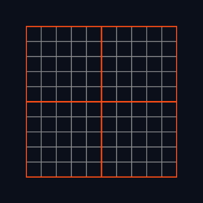
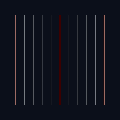
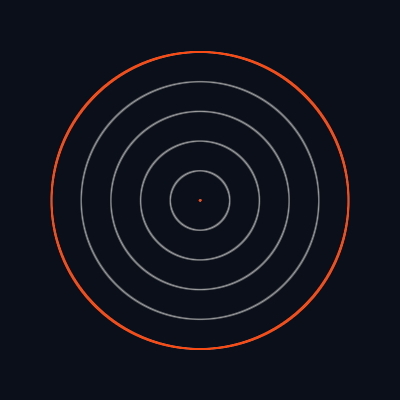
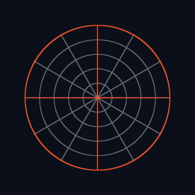
grid: represents a standard box grid. It does not require any additional properties. (default)lines: grid consisting of lines that align along a single world axis. You specify this axis by providing eitherx,yorzto theaxisproperty.circular: grid formed of concentric circles. It includes amaxRadiusproperty that sets the maximum world-space radius for the grid. A value of0removes this limit, allowing the grid to occupy the entire geometry, even if it results in incomplete circles.polar: similar to the circular type, but it also features lines that subdivide the concentric circles. It too has amaxRadiusproperty. Additionally, it has two properties for specifying dividers:cellDividersandsectionDividers. These determine how many lines will segment the circle into various sectors. For example, 2 lines result in 4 segments at 90° each, while 6 lines create 12 sectors at 30° apiece.
| Grid | Lines | Circular | Polar |
|---|---|---|---|
 |  |  |  |
Cells and Sections
Grid is split into cells and sections. Cell is meant to represent the smallest units on your grid, whereas
section is a group of cells. You can adjust the size of the grid by changing the cellSize and sectionSize
parameters. Size is in Three world units, so for example a mesh with BoxGeometry(1,1,1) will fit perfectly into
a size 1 cell. By default a cell is 1 unit and a section 10, which means that a grid of 10x10 cells will be
outlined with a section line.
Lines
You can adjust the color and thickness of cell and section lines with cellColor, cellThickness, sectionColor, sectionThickness.
Grid size and fading
The <Grid> component is a THREE.Mesh with a PlaneGeometry attached to it. The gridSize parameter defines the size of the PlaneGeometry.
You can extend the grid into infinity if you set the infiniteGrid parameter to true.
Changing fadeDistance sets how far from the camera position the grid begins to fade by having its alpha reduced. fadeStrength determines how fast it happens (exponent). fadeStrength = 0 means that there is no fading (not recommended for large grids). You can change the fading point of origin to not be the camera position but a custom point by setting fadeOrigin.
Custom geometry
You have the option to insert your own custom geometry into the <Grid/> slot. The preceding example demonstrates this by showcasing a preview of a terrain-like geometry generated using Perlin noise.
<Grid>
  <T.BoxGeometry />
</Grid>
Follow camera
Setting followCamera to true applies a transform that moves the grid to the camera’s position on the chosen plane.